When your business appears as a single panorama, every trend and metric connects into one story.
Create visual dashboards that allow you to see trends, bottlenecks, or opportunities in seconds.
Focus your team's attention on key metrics so that strategic decisions are based on facts.
Customise the visualisation system to your own processes so that each report instantly transforms data into insights.
for business intelligence succesfull implementation
By providing your phone number, you agree to receive SMS notifications. Your data will be processed in compliance with applicable privacy laws. For more information, please review our Privacy Policy. You may opt out at any time.
We work with information in such a way that managers see not just dry figures, but a living picture of business processes with their logic and real dynamics. The data is transformed into an interactive map, clearly marking the company's development paths and warnings about possible risks.
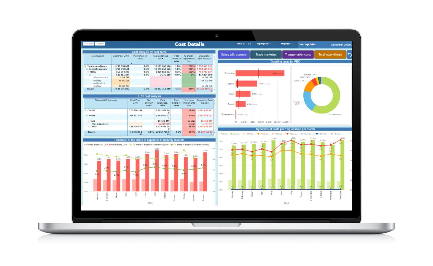
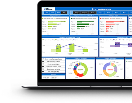
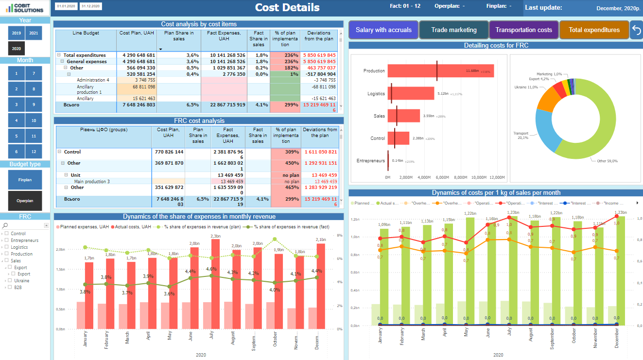
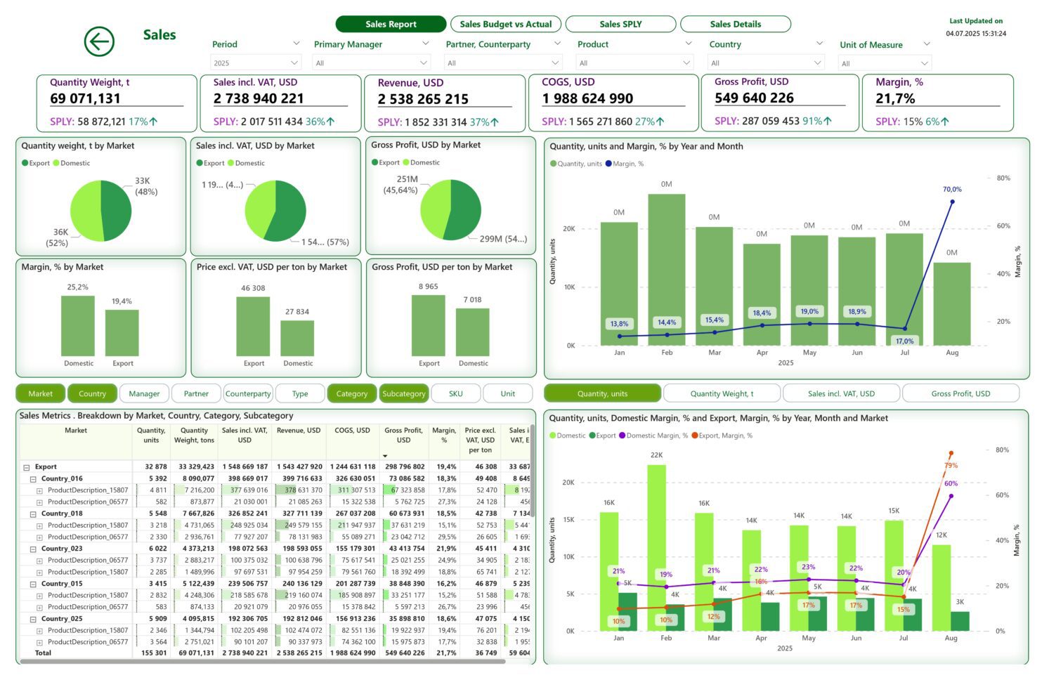
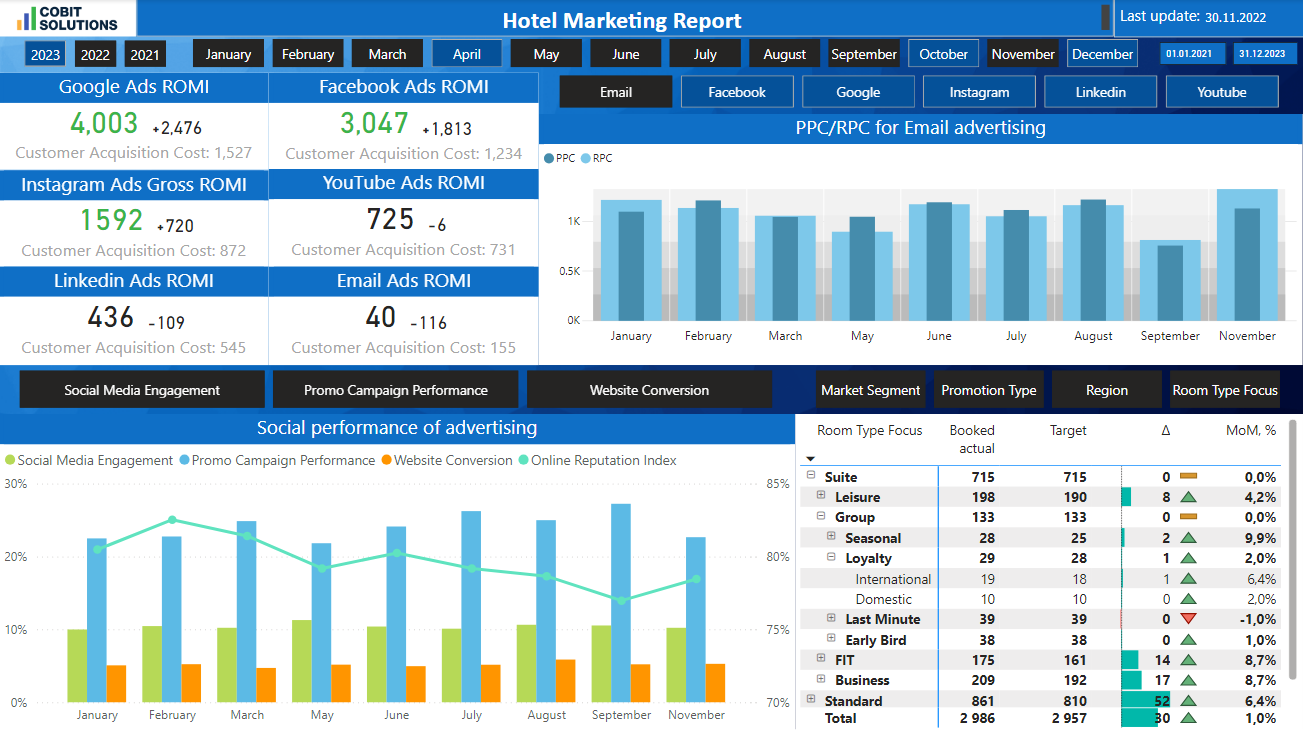
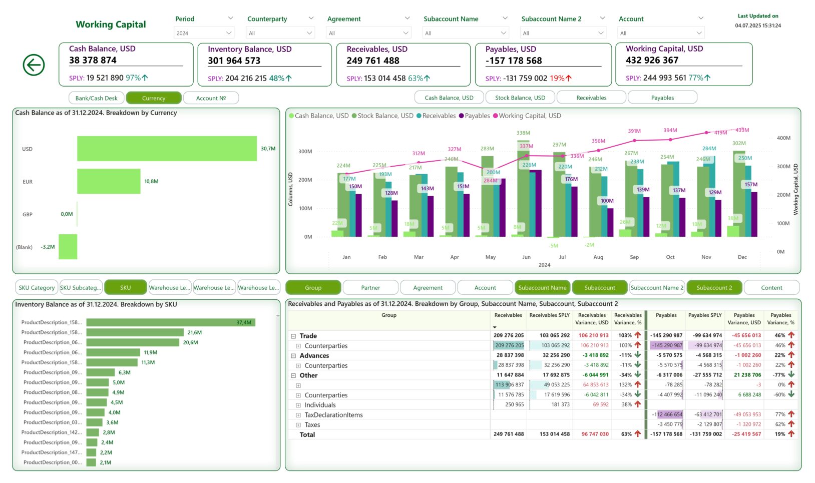
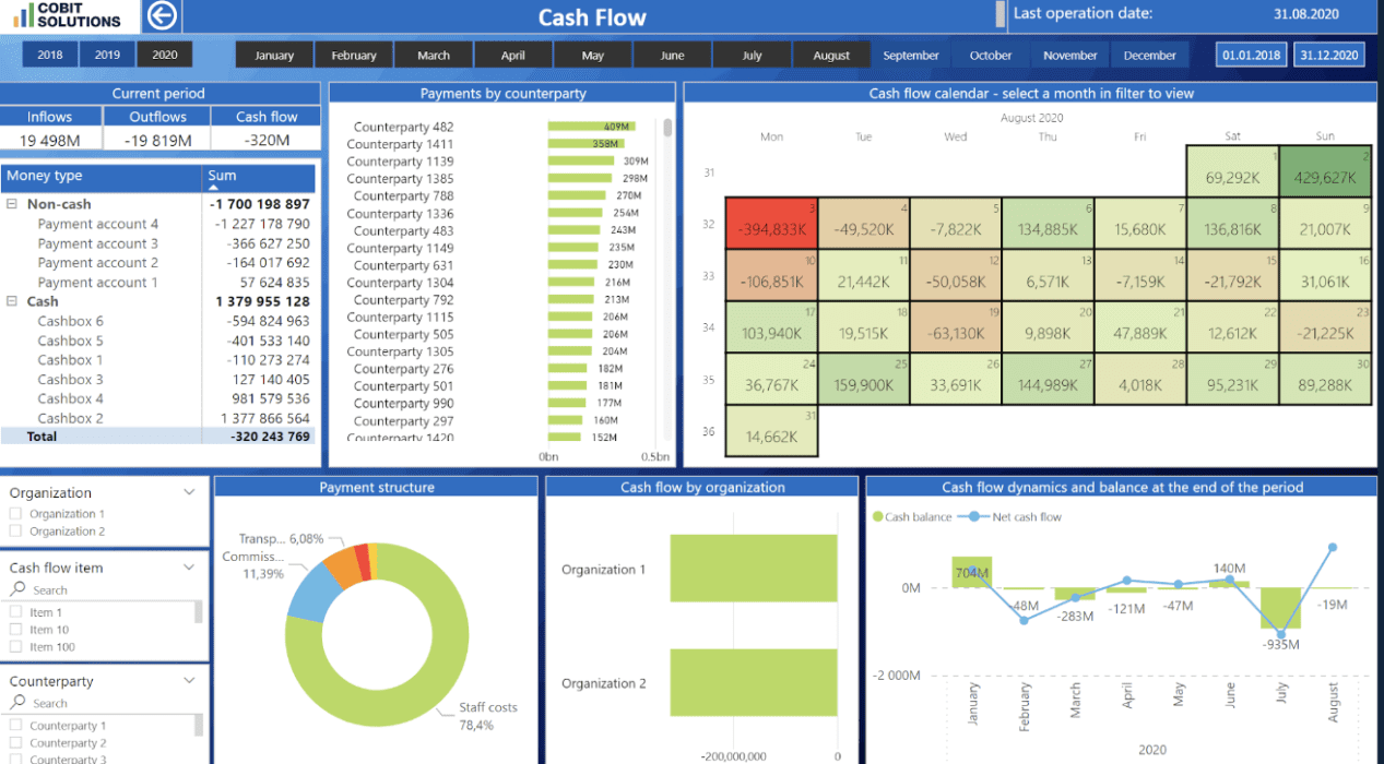
Analytical dashboards display the necessary indicators in an understandable format. They allow you to quickly identify key trends and notice deviations. Individual visual elements show structural relationships between processes without overwhelming the user with details. This allows users to see not only the numbers, but also the context — how individual indicators influence each other and form the overall picture of the business.
The visualization model is built around real business tasks. It covers financial control, operational load, demand forecasting, and team performance evaluation. We design dashboards so that key indicators are clearly visible and not lost among secondary information. This gives you benchmarks for strategic decisions and your teams' daily activities.
All dashboards undergo thorough quality control. We check the accuracy of sources, consistency of metrics, and transparency of calculations. We also monitor compliance with presentation standards to ensure that the data is understandable to everyone involved in the process. As a result, you get a system in which indicators are interpreted consistently at all levels. The risk of errors is eliminated at the design stage, and decisions are based on accurate and consistent data.
We design architecture to be easily scalable. This means that new products, markets, processes, and information sources can be integrated without overloading the system. At the same time, we synchronize visualization updates with changes in the business. This means you work with data that reflects the real situation today and remains relevant in the long term.
Data visualization consultancy enables businesses to see the connections between sales, costs, workload, and productivity, and to identify areas for profitability growth.
The HR department deals with dozens of CVs every day, marketing deals with hundreds of campaign metrics, and finance deals with thousands of expense lines. Without analytics, these are just chaotic tables. When data is structured, recruiters quickly find the right candidates, managers see staff retention factors, and marketers identify the channels with the highest return. This is how numbers turn into decisions that drive business forward.
In companies where analytics are scattered, every meeting starts with executives juggling dozens of metrics, analysts buried in endless reports, and managers forced to trust intuition when time runs short. Patterns stay hidden, and quick reactions become almost impossible. But once data is brought together in clear visual models, the picture changes: managers spot deviations at a glance, analysts connect team actions to results, and leaders see exactly which decisions move the KPIs.
Managers often notice changes too late: when sales have dropped, costs have risen, and demand has shifted. This is because the initial signals were lost in ordinary spreadsheets. Without a clear overview of the dynamics, it is difficult to understand what exactly has changed customer behaviour or team performance. Conversely, when metrics are displayed in visual indicators, marketing sees early fluctuations in demand, finance records cost increases by category, and operations teams track workloads in real time.
In many organizations, the same metric is tracked in different departments under different names, reports contradict each other, and information sources are not synchronized. In such a situation, visualization creates a distorted picture and leads teams to misinterpret indicators. Therefore, you need to order consulting services. The data visualization consultant will align metrics, agree on calculation rules, and prepare indicators in a format that accurately reflects business logic.
A specialist will immediately pick up your analytical tasks and transform raw data into understandable management tools. Thanks to effective visualization, you will notice changes faster, assess the situation more accurately, and make decisions with less risk of error.
Modern analytics requires platforms that can handle large amounts of information, support interactive models, and ensure real-time calculation accuracy. We combine tools that enable you to build flexible dashboards, integrate various data sources, and create visualizations that enhance management decisions.
Our technology stack in data visualization:
If you need data visualization consulting services in the USA, contact us for a solution that delivers results. We will help you build analytics that highlight your brand’s strengths and help you find new niches.
Our team is a synergy of experience in IT, finance, marketing, and analytics. We combine management expertise, deep understanding of business processes, and technical skills. That is why we create truly effective analytics that unlock hidden opportunities for your business growth.
Founder
Expert in IT with 19 years of experience.
10 years on CIO/CTO positions.
Certifications:
Managing Partner
& Finance PM
10 years of experience in finance and consulting in large companies and holdings, experience in IFRS
Certifications:
Finances PM
7 years of experience in Finance in large companies, CAP
Certifications:
Head of Marketing
Chief Business Officer
Customer Relations Manager
Technologies used:
457
dashboards created in 2024150+
years of IT experience among employees20
data experts & BI consultants12B
USD annual revenue of clients that utilize our analytics solutionsAs part of our data visualization consulting services, we select the type of graph that most accurately reveals the essence of the indicators. It’s like choosing the right optics: just change the lens, and the patterns for management decisions become visible at a glance.
Take advantage of our expertise to turn analytics into a tool for real action!
Our experience includes hundreds of solutions, billions in turnover, and the trust of dozens of company executives in five countries.
☑️ We created 457 information panels in 2024 alone — we work quickly without compromising on quality.
☑️ We work with 70+ clients in 5 countries — our approaches are adapted to different markets.
☑️ Our analytical solutions support $12 billion in annual turnover for our clients — accuracy has financial value.
☑️ We offer consulting services at 25% less than in-house analysts or freelancers.
☑️ We have over 15 years of experience in IT — every solution is based on in-depth expertise.
☑️ We deliver results with our own team of 25 specialists — we work without contractors and take responsibility for the outcome.
Contact us today to turn data into a competitive advantage for your business.
Our clients get stability, transparency, and confidence in every data-driven decision.
Healthcare
Result:
Logistics
Result:
Manufacturing
Result:
Industry-focused case studies designed for your needs
Visual analytics helps you make decisions faster and more accurately by turning complex data sets into easy-to-understand graphs and dashboards. In other words, it’s a tool that gives businesses specific answers: where to focus resources, what to optimize, and how to get a tangible financial return.
In one retail project, a store chain with hundreds of SKUs across multiple regions discovered through interactive dashboards that just two product categories were driving nearly half of the profit, but only in specific areas. That clarity reshaped their strategy. This made it possible to reduce costs at unprofitable points, reallocate the budget, and increase investment in regions where the products were actually working. The result was a 12% increase in turnover for the quarter.
At a manufacturing company, analytics showed that delivery delays were caused by one specific stage of logistics. Visualization of the process enabled managers to quickly localize the problem and optimize the supply chain, reducing order fulfilment time by 20%.
Yes, we develop dashboards tailored to your organization’s specific KPIs. Before we start working, we analyse the logic of business processes, the structure of metrics and data sources so that the dashboard displays a comprehensive model of efficiency rather than a set of numbers.
For example, for the commercial department, we can build a dashboard that combines revenue, margin, lead conversion rate through the funnel stages, and customer acquisition cost. Managers can see where conversion is slowing down, which managers need support, and which campaigns are delivering real returns.
Each dashboard has its own structure, filters, access levels, and update mechanisms so that you get an up-to-date and accurate picture at any given moment.
Cobit Solutions has experience in projects in more than 20 industries. These include banking, energy, logistics, manufacturing, medicine, insurance, retail, e-commerce, pharmaceuticals, retail, IT companies, distribution, media, food production, construction, metallurgy, and others
The timing depends on the amount of work, the number of sources, and the complexity of the models. At the start of the project, our data visualization consultant assesses the structure of your metrics, the availability of sources, and technical requirements, and immediately provides an estimated timeline. Small dashboards can be deployed in a few days, while complex systems with integrations and KPI models take from one to several weeks.
For example, for a retail chain, we connected data from POS systems and created basic dashboards in just 10 days — managers immediately saw the real picture of sales by region. And for a manufacturing company with multi-level logistics, the process took about two months because we had to integrate various data sources and set up automatic updates.
Thus, simple solutions are launched very quickly, while complex projects take from many weeks to numerous months — but always with a clear plan and predictable results.
Yes, we provide post-implementation support and regularly update dashboards in line with changes in your processes and metrics. You will be assigned a visualization consultant, and a specialist will monitor the accuracy of models, add new KPIs, optimize dashboards and respond promptly to your requests. This format has been proven to guarantee the stable operation of your analytics system and rapid updating of solutions.